Picking the right font style for your brand should not be taken lightly. It may seem insignificant to some but that “small” detail can have a major effect on your brands’ image and marketing. Typography can influence viewers and set the tone for your entire brand. When it comes to typography, it plays into all aspects of your marketing; from your logo to print collateral and your website. Much like the psychology of colors, fonts can instill certain emotions. Recognizing a font can communicate different subconscious messages. You need to pick the right font that will help deliver the right feeling the second they see it.
Whether designing a website or a logo for our clients, we guide them through the right process for determining what font will help them reach their marketing goal. That process, although similar in many ways, needs to be different depending on the design needs. For example, when choosing a font for your website you need to fittingly represent your message and compliment your logo while ensuring your font will read well on desktop and mobile versions of your site.
Canva provided an excellent breakdown of font design and the importance behind it that we’ve highlighted below.
“The typeface is the design; the font is how that design is delivered. typeface + style + size = font A font is what you use; a typeface is what you see. The distinction dates back to traditional printmaking with metal type. The unique style or design of the alphabet that we identify by name — say, Times New Roman or Bodoni, would be considered the typeface. When those letters needed to be cast at a particular size or weight (10 point bold, for example), that would be considered a particular font. So 10 pt. Bodoni bold and 24 pt. Bodoni italic would be two different fonts, but the same typeface.”
How to choose a font?
“If the characteristics the font is communicating don’t match the message of your overall design, then there will be a visual disconnect for the viewers or users of your design, and you don’t want that. When browsing fonts, it can be easy to get caught up in all the fun and interesting choices, but don’t let personal preferences get in the way; a font you think is distinctive or stylish may not be useful or appropriate for the project you’re working on.
If you find yourself getting off track, just ask yourself this question: Does this font support the qualities of my brand or complement the purpose of my design? The most effective font choices do just that.”
What type of fonts are there?
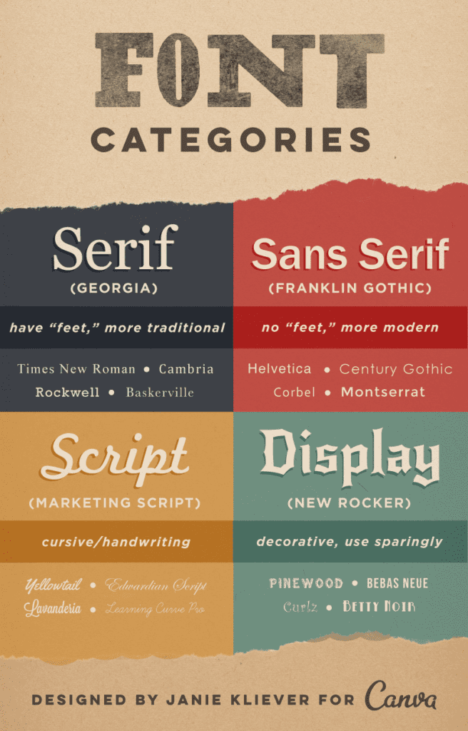
“1) Serif: Serif fonts have little “feet” or lines attached the ends of their letters. They’re generally thought to look more serious or traditional.
2) Sans-Serif: “Sans-serif” literally means “without serif” — these fonts don’t have the extra lines on the ends of letters. For that reason, they’re generally thought to look more modern and streamlined.
3) Script: Scripts are what we might think of as cursive- or handwriting-style fonts. They generally have connecting letters. You’ll find that script fonts come in many different styles, from elegant, to fun and casual, to hand-drawn.
4) Decorative / Display: When you hear a font categorized as decorative, display, or novelty, it all means the same thing — that font is meant to get your attention. They’re often more unusual than practical and should only be used in small doses and for a specific effect or purpose.”

Is your font choice suitable?
”Body typefaces are used in body copy: book text, magazine or newspaper text, website content, any lengthy passages. These fonts are easy on the eyes and easy to read. It’s important that they’re not distracting, so users can easily skim or scan the text.
Display or decorative typefaces, on the other hand, are never suitable for reading at length. These are the type of fonts that scream, “Look at me!” and should be used sparingly and with purpose.”
Combining fonts.
“Choosing two or more fonts to use together can be tricky. You want the fonts to complement each other, but not be too similar — different, but so wildly different that they clash. Avoiding these extremes of too little or too much contrast often ends up being a process of experimentation and trial-and-error.
Find a shared quality: Fonts that look significantly different but share something in common are more likely to work well together. That quality might be general proportions like letter height or width, or two fonts might share an underlying structure or skeleton. Even if the similarity is subtle, it will help give your font combination a basic cohesiveness.”
But how many fonts are too many?
There are those in the design community who would say that one font will do for most projects, and that three is the maximum number you should include in one design to avoid an overly busy or confusing layout. While that’s a good starting point if you’re new to design, there really are no rules — at least, no rules that can’t be broken in the right situation. Some designs will call for a certain aesthetic or an extra-decorative look that would benefit from a wider range of fonts.” Others need to be simple and straight to the point, where one font in different sizes and weights will do just fine. Other variables become present when utilizing web friendly fonts to allow your web presence to render accordingly.


