Facebook is at it again, making big changes to the Facebook Pages layout.
We first noticed the changes in July and immediately realized that Facebook is rolling these changes out a little differently than normal. For instance, some people at Web Strategies have the new page layout, but some still had the “old” one.
Often, when Facebook debuts a new design, they do it page by page, but it appears that this time around Facebook is rolling out the changes on a user by user basis. There’s no official word from Facebook about when the changes will roll out to all users, or if what we are seeing is even the final version of the new layout, but here’s a sneak peek at what may be coming.
Here’s what we’re looking at today:
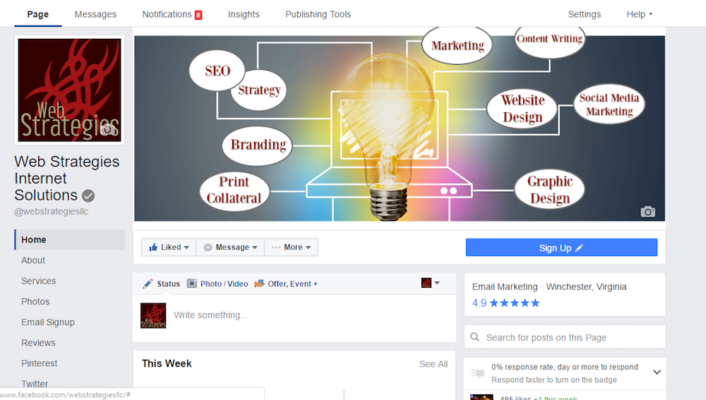
Cleaner cover photo
Facebook has removed the logo from the corner of the cover image.
Profile image has moved to left-hand column
Our logo appears slightly bigger than it was before (though we were able to use the existing image without any issues)
More Page Tabs are visible
Page tabs appear under the logo, and on our page, every single tab/app was listed.
Like and Message Buttons have moved
Along with the page tab links, the “Like and Message” buttons have also moved underneath the cover image, positioned to the left.
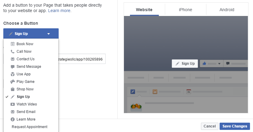
Call-to-Action button is bigger (and has moved)
The call-to-action (CTA) button has changed from white to blue and will live just under the cover photo. These changes will help the CTA button pop more and might make it easier for the customer to take action. The CTA button includes, “Book now,” “Call Now,” “Shop Now,” “Watch Video,” “Request Appointment,” and “Send Email,” and more.
A search bar that lets you search for posts from the page.
A search feature appears on the right-hand column and enables users to search content specific to a brand’s page. Instead of scrolling for ages to find an old post, the search button is now clearly visible. The search feature enables you to search and index your own content, in addition to checking out what your competitors have posted.
Okay, those are the highlights. So far, we’re liking the cleaner overall look and greater focus on accessibility for the user. Hopefully, this not only will allow your visitors to click around quicker, but also will steer them to your call-to-action buttons.
Sign up for Our Newsletter!
Like it? Share it!
Did you enjoy this article? Check us out on Facebook, Twitter, Pinterest and LinkedIn!