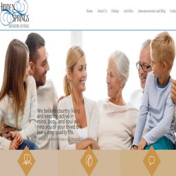
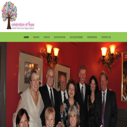
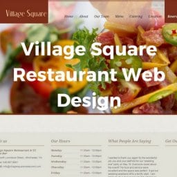
Do you have good content, but high bounce rate? Have you ever wondered why people are leaving your site right away? The design and layout of your website may have something to do with it. Read on to find out how web design affects bounce rate.
What Is Bounce Rate?
Wikipedia defines bounce rate as:
“A term used in web site traffic analysis. It essentially represents the percentage of initial visitors to a site who “bounce” away to a different site, rather than continue on to other pages within the same site.”
Essentially, bounce rate is the percentage of all viewers who enter and exit on the same page, without any clicks to other pages on your site. In many cases, the lower the bounce rate, the better your website is. This is because a low bounce rate means visitors are actually taking the time to explore your website’s content.
First Impressions Count
Eye tracking studies have shown that it takes less than a few seconds for visitors to form a first impression of your website. While content and load speed should be considered when evaluating bounce rate, for this blog we are talking specifically about how web design affects bounce rate.
Proper and professional website design can improve your bounce rate by a lot! One study found that 94% of visitors would reject a website or mistrust a company based on its design-related aspects. These elements include a busy layout, too much text, and a boring design and use of colors. Irrelevant content only accounted for a mere 6% of reasons why a website was rejected due to negative first impressions.
However, it should be noted that if landing on a page addresses the visitors’ needs and they leave then a high bounce rate may be good. An example would be your contact us page. If a visitor is simply looking for a phone number or e-mail address, they will find the information and leave. In this case, a high bounce rate means that you quickly provided them with what they needed, which is a good thing.
src=”https://webstrategies.com/wp-content/uploads/2015/12/bounce.jpg”
Designing a Good Website
- Have an artistic or creative homepage. The first thing your viewers notice on your website is the homepage. This is your chance to catch your viewers attention and encourage them to continue exploring your website. Keep it clean, attractive and helpful.
- A site with user-friendly interface and navigation is something your viewers will love!
- Your site’s navigation should be:
- Noticeable. Making the navigational menu visible and noticeable urges your viewers to go from one page to another, while staying within your website.
- Easy to understand. As a rule of thumb, from the moment your viewers see it, they should know how the navigation works. Don’t make them work or wonder how to find the info they are looking for.
- Attractive. Make your buttons attractive with font, contrasting colors, or by utilizing a hover and release effect. You can create visual appeal while still keeping your site clear of clutter.
- Less is more. According to Inc.com’s Samuel Edwards, visually complex websites aren’t nearly as appealing as simple websites. If you want to make a good first impression on website visitors, simple is best.
- Utilize relevant and captivating images. Viewers find visual content more interesting than plain text, but combining the two makes for an amazing website!
As a web design company, we understand how important it is to understand the relationship between web design and user experience. That is why we use a five-step method to ensure that your project unfolds at the highest standard and to your exact specification and needs. See our five steps here.


