 More and more people are choosing mobile devices over desktops these days and brands are finally beginning to take notice.
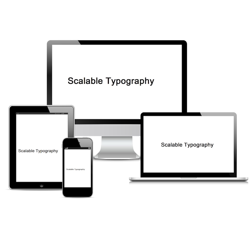
We’ve been seeing an increasing amount of brands redesign their logos with sans-serif typefaces, because these typefaces tend to scale well and look great no matter what size screen they’re on. We call this Scalable Typography.
Did you notice the change in Google’s font during September 2015? The company, who had been known for their serif font since 1999 switched to a sans-serif font designed by its own team of designers in an attempt to modernize it and make it scalable at any size.
Google Design explains, “The final logotype was tested exhaustively at various sizes and weights for maximum legibility in all the new digital contexts.”
Sans serifs are easier to scale because the forms are simpler than serifs. If you make a serif font too small, it might begin to blur the serifs together and make it harder to read.
An increasing amount of designers are starting to come to the conclusion that serif letters are better for print projects, while sans serif fonts are better for screens.
So which will it be–serif, or sans serif? Consider your choices, and make sure your font choice conveys the feeling and look that you want, and that it is readable on many devices.