 While website/social media branding is fundamental to marketing, there are lots of times you need print materials to make a great real-world impression.
Just think – while web pages are often skimmed in less than 15 seconds, your print materials can live in offices and homes for years. For this reason, you should always think about designing print materials that match your branding. In other words, your ads should have a consistent aesthetic in terms of fonts, colors, and types of images to establish brand recognition.
Business Card Design
In our opinion, business cards are one of the most important print collateral for a business because they stand as a symbol of who you are professionally. It’s the first impression you hand off during a greeting and what will last afterward.
There’s not much space you can use, so keeping it simple is key. When considering your design you might want to leave it to a graphic designer to create a professional piece you can be proud of. A good designer should be able to help guide you in what’s appropriate; i.e. basic, recognizable elements of your branding – color, typography, and core design elements. Also, don’t clutter it with all sorts of information. You want to present them with the most relevant information, meaning name, title, company and any other necessary contact information.
Business Card Design Tips:
- Use the color scheme from your branding document.
- For better impact, utilize the front and back of the card.
- Double, triple and quadruple check for any typos.
- Get them professionally printed.
Stationery Design
If your business requires formal correspondence with clients, you probably need stationery, such as a custom letterhead. Much like your business card, simple designs work best for stationery.
Stationery Design Tips:
- Use the color scheme from your branding document.
- Use your logo as the main design element.
- If you’re including contact information in the header, keep it to one major point of contact (like a web address); otherwise, include it in the footer.
Brochure Design
Believe it or not, the small, portable tri-fold brochure is still alive and kicking. Lots of businesses need to use them frequently, including restaurants and other local and corporate businesses.
Brochures can be printed for a specific event, program, or premium service – but can also be used to present general information about your business. No matter the goal, professionally branded brochures should be informative, eye-catching and relevant to the reader. The key, of course, is finding that balance between text and imagery.
Brochure Design Tips:
- Use the color scheme from your branding document.
- Use relevant, high-resolution images to break up content-heavy areas.
- Limit yourself to about 4 colors, and use each color consistently throughout the brochure.
- Use bullet points to break up lists.
- Make the brochure easy to skim with headers, sub-headers, and captions.
- Keep the design simple; too much information will clutter and hide your original message.
- Choose an easy-to-read serif/sans-serif typeface for your copy and one or two additional fonts for headings.
- Get them professionally printed for best quality.
Rack Card Design
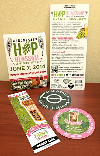
Rack cards are an upgraded, swankier version of a brochure. The double-sided, simplified format gives them a classy look, which is more appropriate for some businesses.
Many rack cards are used for event listings, takeaway menus, or trade shows but with a custom design, they can serve many other purposes. When it comes to layout and content, rack cards have similar guidelines to brochures, but you’re generally dealing with less space for content, so everything should be simple, concise and impactful.
Poster Design
Posters allow you to express big ideas or events through text, imagery, or both. Essentially, the design can be as simple or complex as you want, but it should always be aesthetically pleasing.
Poster Design Tips:
- Choose colors that express your idea.
- Be creative with your typography, but don’t incorporate more than 4 font choices.
- Have fun, but be detail-oriented.
- Think about how the viewer’s eye will bounce from one element to another.
- Have them printed professionally.
While many businesses have completely migrated their advertising efforts to the web because of its cost-effectiveness, exposure potential, and convenience, print media is still going strong. Used appropriately, print media can solidify your brand identity and readily engage consumers. It’s important for companies who want a well-rounded marketing strategy to be designing print materials that match their branding.
We offer a variety of print collateral services including:
- Advertisements
- Restaurant Menus
- Fliers and Business Cards
- Brochures and Rack Cards
- Programs for Special Events
- Logo Development
Contact us to discuss your next print project.


