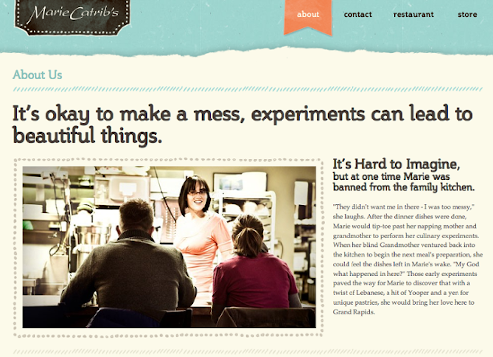
 Do you ever find yourself green with envy when you look at competitors websites? Have you ever wondered how to make your About Us page stand out from the crowd? In Lindsay Kolowich‘s article, 12 About Us Page Examples That Are Probably Better Than Yours, she shares why she likes 12 particularly awesome ‘About Us’ pages and we’re here to tell you how we can help you not only match the competition, but stand proudly out in front.
Your web design generates a client’s interest in your business, but for them to make a decision on whether or not to deal with your company, they need to know more about you. Your ‘About Us’ page should portray your company’s unique identity, and do it in a way that engages the viewer. How will you make visitors trust you if your About Us page looks a little off? Remember that potential customers would like to know as much as possible about you and your business.
So what are our tips for creating one of the most important pages on your website (and also one of the most commonly overlooked pages)?
1. Tell Your Story
so this is your chance to humanize your brand and provide context and meaning for your product. Use a combination of words and easily digestible graphics to paint a picture, rather than using big chunks of text. Be clear about why you’re different and what you bring to the table.
2. Showcase Your Brand’s Personality
You’re not like everyone else — so why should your ‘About Us’ page be anything less than amazing? Use your ‘About Us’ page to show off who you really are!
People tend to think that ‘About Us’ pages have to sound formal to gain credibility and trust. But most people find it easier to trust real human beings rather than a stiff, formal, and “safe” design.
3. Don’t Be Afraid To Add Media
Instead of following the classic script and writing a few paragraphs about the company’s mission and how it was founded, there are plenty of ways to make it a little more visually compelling.
One minute of video is worth 1.8 million words, according to Forrester Research’s Dr. James McQuivey. Videos can tell your story in a quick, digestible, and engaging way. Just
4. Stick to the Straight Talk
Think industry jargon makes you sound super smart on your ‘About Us’ page? Think again. People want — and appreciate — straight talk about what your business does. After all, if people can’t figure out what you do, how will they know they need your product or service?
Our tip is to use simple but polished language effectively so that you can communicate what you do while still allowing the Average Joe to understand it.
5. Connect the Viewer to Your Team
One signature piece of any ‘About Us’ page is a list of company leaders and executives. You can do so much more than the typical ‘names, positions, head shots, and short description’ method to connect the people visiting your website with your team.
We love the idea of adding social buttons that link directly to their LinkedIn, Twitter, Facebook, or email. (Just make sure profiles you’re sharing are business appropriate). Get personal by including pictures of yourself, your real staff (no stock photos), the outside of your establishment, the office dog, etc. These images again build upon that story you’re trying to tell.
6. Let Other People Do The Talking
Say you’re looking to get a haircut. Business A sends you a flyer stating that they give great haircuts, but your neighbor ‘Stacy’ just got her hair cut at Business B and says they did a great job. Which business would you trust more? I’d almost bet money that you’d choose to get your hair cut at Business B. In fact, people are four times more likely to buy something when it’s recommended to them by a friend.
This is why many businesses should consider including customer and employee testimonials on their ‘About Us’ page. By including testimonials (with pictures so site visitors can put faces to names) and a list of companies that “trust” the company, your company automatically becomes more likable and trustworthy.
The ‘About Us’ page is a great place to showcase some of your culture.
Your ‘About Us’ page is usually one of the first destinations visitors will click when arriving to a site. If they aren’t impressed, you can expect them to leave without reading your awesome content, signing up for your newsletter or making a purchase.
Here at Web Strategies, we take great pride in creating websites that provide great information and are infused with color, personality, and stay true to a company’s unique brand voice.
Contact us if you’d like some help with your website design!
Photo retrieved from The Internet Digest.


