Welcome back to Education with Emily. Today I’d like to talk about the four main types of navigation on a website. Certainly, without navigation, it would be difficult to move from page to page within a website. However, we also use navigation to give us more clues about how the information is organized. We use different types of navigation in certain places to provide access to different areas of the site and create a simple and clear user experience for our client.
1. Primary Navigation
What is primary navigation and where is it located? Well, typically we see primary navigation at the top of the page. This is because our eyes typically start at the top left of our browser screen and work horizontally across the page. Primary navigation will hold the bulk of our page structure and starts to provide the hierarchy for our website. Sometimes you will see top-level pages with sub-level pages that appear when you hover over them. This helps us to group information in a concise way and could give us an informed decision on where to click next.

2. Top Bar Navigation
Some sites have what I like to call a “top bar” which floats just above the primary navigation in a smaller line. Typically, I will make the font in this area smaller and distinct. In the top bar navigation area, we can place callout links, or a login/sign up link. It is an easy to access area that appears on every page so it is easy to sign up at any time and doesn’t clutter our primary navigation bar.

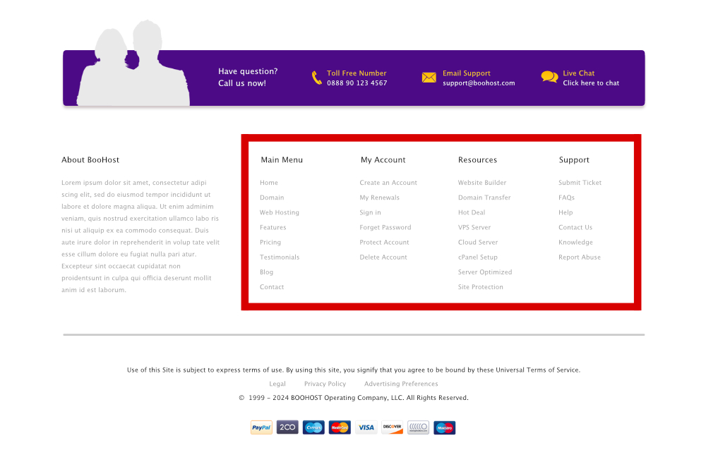
3. Footer Navigation
The footer of a site isn’t the first thing you see on a site so typically we can place some less needed or miscellaneous navigation items down there. Every site is different, but I usually like to include account access and customer service links if the site includes a shop. It is also a great place for terms and conditions, privacy policies, return policies. Or maybe a list of most recent blog posts if your site has a focus on a news feed.

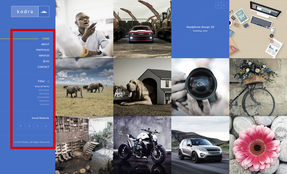
4. Sidebar Navigation
Sidebar navigation is probably the only navigation item that does not go on every page. I will usually only use sidebar navigation if a website has a large grouping of pages under a certain topic or multiple groups of pages that require easier browsing. This alleviates the user from having to scroll all the way up to the top and find the link in the primary navigation if it is even there. I will list the other pages that are in the same group as those pages are most relevant to that page. So we could have different sidebar menus for different pages on a site.

Those are the four main types of navigation I use when I build a website and hopefully it was useful to you to see how clear navigation can make a difference on your site. Does your website seem cluttered and disorganized? Maybe reorganizing the navigation would make a difference. Call us today or fill out this form to see how we can help you make your website easy to use again.

