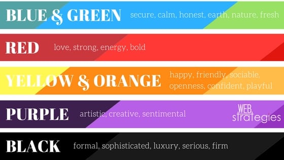
When it comes to recognizing your brand, your logo is usually the first thing your customers think of. According to Colourfast, 93% of purchasing judgments are made on visual perceptions and 80% of consumers believe color increases brand recognition. If you aren’t happy with the message your logo is representing for your business today, then it’s time for a change. We’ve talked about the first step in rebranding. Once you’ve successfully gone through that internal checklist you can start your rebranding journey with your logo.
This is a crucial step in your branding process and should not be taken lightly. Your logo is the face of your business. It’s the representation that will allow your audience to create a visual reminder, a connection to your product or service. A logo is often the first thing someone sees about your business. If it’s not a healthy representation it can create a negative aversion.
What to do:
Brainstorm your ideas. Make a list. What do you like and dislike about your current logo? What elements are important for you to include in your new logo? What wording and visuals do you think represent your business? Ask yourself, what kind of emotion do I want my brand to convey? What main emotions do you wish to evoke when someone thinks of your brand or sees your logo?
Work with a talented graphics designer that can create a logo that represents everything you want it to. Create different versions of your logo. You won’t always have the same sized space for your logo placement, so make sure you’re prepared with a logo that has horizontal and vertical layouts and can be scaled to look good in a variety of sizes. Depending on the design, you might want a version that’s black and white, full color, or simplified in multiple file formats.
Do your research. For example, find out what colors can reflect the feelings you want to encourage and know which ones to eliminate.

What to avoid:
Don’t rush into a design. Introducing a new logo as a representation of your brand needs to reflect the time and care you’ve put into the rebrand. “Change” is not always welcomed, especially if it’s with a trusted business. But, if the change is long-awaited and professionally executed, it should be welcomed with appreciation and understanding of the need to better represent the quality that has stood behind your brand all along.
Don’t settle for a “simple” design because you think it’s not that important. Don’t underestimate the judgment that can come from first impressions. Don’t clutter the design, keep it simple and timeless. Avoid trends (unless appropriate). Consider shape psychology.
Avoid the “$5” logo design. Cheap work is rarely good, and good work is rarely cheap. When you’re putting your brand in someone else’s hands, whether it’s a logo, website or print work, don’t ever look for ‘cheap’. Go for ‘fair’ or ‘quality’. The difference between a $5 designer and a professional? A good designer will spend much more time thinking about your company, trying out different concepts and discussing their vision with you before sending you a few designs. You work through the designs together and collectively create the perfect representation that is original and yours.

