The key to pulling someone into your website is to create a connection. By building emotion into your website you open your chances of relatability. It sparks something in the user that makes them want to keep exploring. It brings out an emotion that allows them to feel comfortable with what your site is portraying and they can connect to that in a way that encourages them to proceed.
Throughout our years of experience from redesigns to fresh build-outs, there are key elements that have always been the staple of any successful website design. Wordtracker.com shared their 3 best strategies to build emotion into your website and we completely agree! As we are currently going through a redesign of our own, we have carefully considered each item to ensure we were comfortable with the message our website portrayed both visually and through our content.
1. “Utilize color psychology”
Consider your target audience and any specific trends that may be beneficial to your branding via color psychology. The emotional backing that your color palette plays a part is significant. Colors can signify all the emotions and if not carefully considered, it can represent the opposite of what you wanted. Do you want to create a sense of fear, sadness, urgency or happiness, gratitude and cheerfulness?
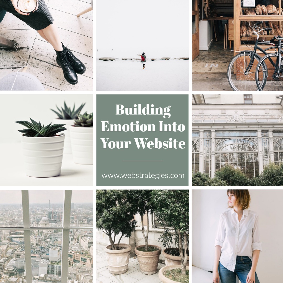
2. “Include images that have value”
Don’t get me wrong, we are all for a good stock image and certainly if we are in need of high-resolution photos that the client simply can’t provide. However, the images used need to have significance. For example, don’t just slap a generic group of people smiling and laughing away if you are trying to represent a specific demographic of people who are taking a matter very seriously. Yes, the image may fit the space and look crisp and clean but, is it complementary to the message you are conveying? The images you use need to compliment your brand and stand out as an enhancement to your website, not just a “filler”. Create that needed connection via the imagery you use. Draw attention and keep it throughout by using visuals that are meaningful to the location they are placed. Coupling the images with the right color palette will guide users in the direction you desire.
3. “Communicate your message clearly and effectively”
Don’t leave them guessing what your brand is about. You also don’t want to bore them with endless amounts of information to scroll through. Keep a healthy balance of content that will allow you to effectively relay your message and purpose. “You can’t make users feel an emotional response from your website if they A. don’t understand it, or B. aren’t even on your website.”
Conclusion
“Create a color palette that sends subtle messages of the feeling you’re aiming for. Use high-res images that are informative and users will be able to connect with on a personal level. Design a clean, organized website and use well-placed, well-written text to communicate your message simply and effectively.”