After a website gets approved by the client, it goes into a full testing phase. With two developers, we usually have the other person test our sites. It’s easier to spot errors when you’re not as familiar with the site. We each have slightly different methods for testing but go through the same procedures to make sure nothing gets missed. Let’s talk about how I test websites for mobile responsiveness.
The first step is to ensure everything looks right and performs a certain way on desktop. This sets the standard for how things should act on mobile. I’ll go through each page, click on links, and look for things out of place or blatant spelling errors. I take screenshots of anything that doesn’t seem right, noting errors as I go.
The next step is to start viewing on smaller devices. I like to start on a landscape-oriented tablet like an iPad Pro and see what changes. I’ll keep working down a size in devices until I get down to mobile. What do I look for when I’m going through each device? Well, several things.
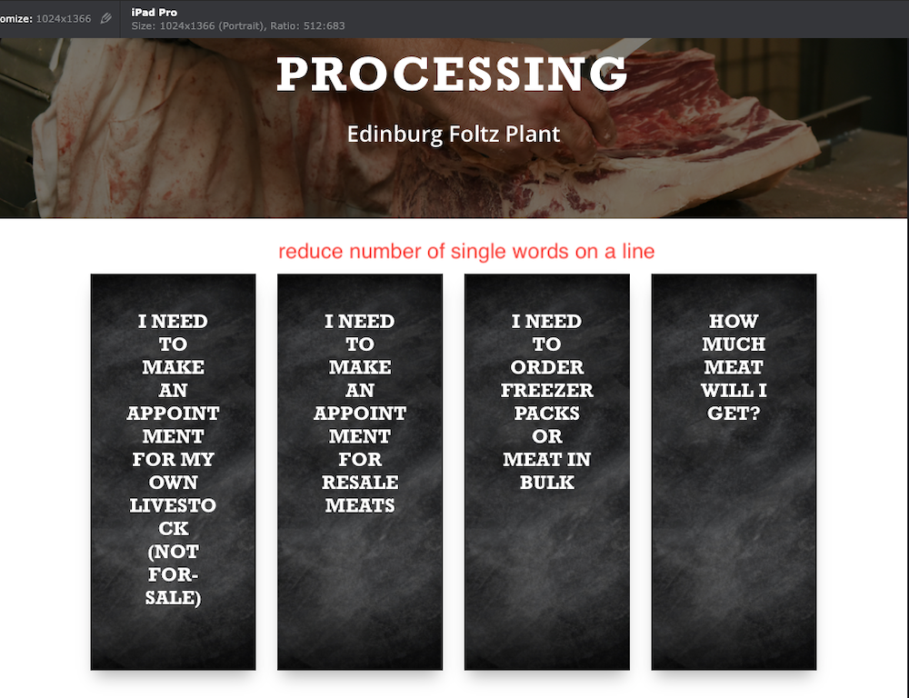
Squished text
We want to make sure that we have lines of text that don’t read at one word per line. Not only is it hard to read, but it looks a little bit jarring and unprofessional. The solution to this problem may be to make this row wider, reduce the text size for this device, or reduce the padding around the text, or maybe a combination of those solutions.

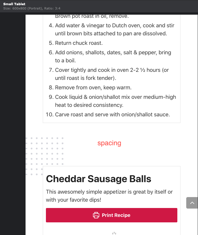
Extra space
Sometimes there’s just extra space between elements that stops the flow or looks awkward on smaller devices. It’s especially noticeable on mobile, but there can be some instances where it looks strange on tablet as well. The solution to this is usually easy; just reduce the space there for that device! Sometimes that means adjusting multiple elements to get enough space reduced.

Overlapping Text
Sometimes the text just doesn’t fit, and that’s when it starts to do weird things. It will break into two lines, and it will run into the text to the right of it or skew itself so it’s no longer centered. Usually, the solution to this is to decrease the text size for that element or decrease the spacing around the text, so it has more room to do its thing. Here, I reduced the text size to keep it from breaking.

There’s a lot that goes into testing a site. We always take the utmost care to carefully go through each site to ensure that nothing gets missed. Sometimes, it takes both developers to look at a specific issue to find the best solution. I hope you enjoyed this insider’s look at how we test websites!

