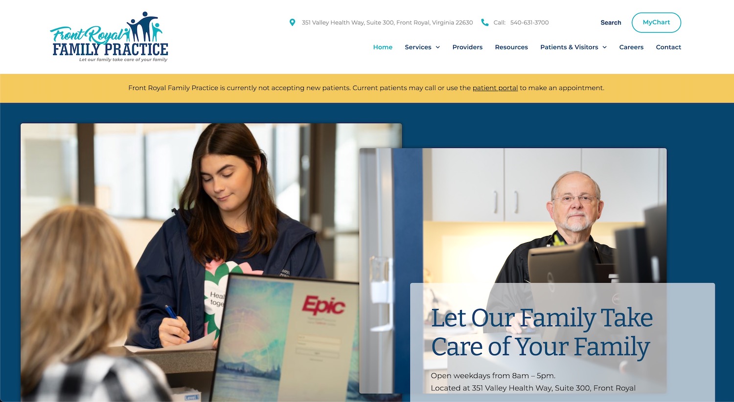
Front Royal Family Practice came to us needing a complete rehaul. Their old site and logo no longer communicated their current practice and team. With a rainbow color pattern and some outdated photos, they wanted something that more accurately reflected the standard of care they provide for the Front Royal community.
We started with the logo. The client wanted to stay in the blue color palette and keep the tagline: “Let our family take care of your family.” We came up with several iterations of different blues and different formats and different fonts, but the client ultimately decided on the one you see below. Using the iconography of the family to clearly communicate the practice’s focus towards all stages of life.

When we got to the website, we worked with Front Royal Family Practice to update content for each page. The biggest giveaway to date the old website was imagery. They hired a photographer to have new photographs of the facility and team taken which helped fill the pages with smiling faces. Additionally, a video was captured that showcases the facility and area with drone footage. It really makes their practice stand out as a leader in the community.
Other notable areas on the site are the mega menu for services listed out, making it easy for potential patients to easily find the area they are looking for. The providers page has buttons included to jump to the appropriate section. The header includes links to MyChart for easy access for patients to access their account through Valley Health.
We really love the fun colors and the focus on treating the whole family and hope it will be a great asset for their practice for many years to come.

