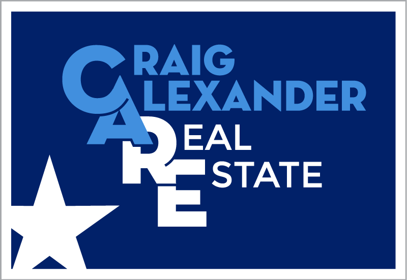
Craig Alexander Real Estate
Craig Alexander is a local realtor who needed a logo refresh. He wanted to separate himself from the logo trends in his market, as well as keep the colors consistent with a secondary logo that appears on his printed collateral. By avoiding iconography and instead focusing on font treatments, we were able to create a logo that is unique in a saturated market and that speaks to the level of partnership he has with his clients. Craig Alexander Real Estate CAREs!
Client
Craig Alexander Real Estate
Category
Logo Design


