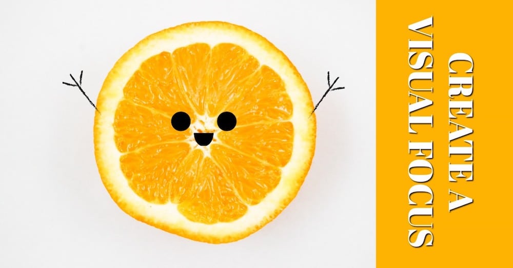
Branching off of our post from last week about “Visual Content Marketing“, the same ideas apply to your website and blogging. We are living in a “visual” world. Consumers absorb and retain more information through visual components (images, videos, graphics, music) than by simply reading content. This isn’t just applied in social media. We need to put the same concepts towards our blogging and website, create a visual focus. There seems to be a popular theory among business owners that if they put all their focus on their website then they don’t have to do as much on their social media, and vice versa. That concept is wrong! Your audiences preference will vary and you need to make sure you are reaching them through all medias possible. No matter the platform, the importance is creating a visual impact that will attract your target market. “Studies show that new visitors develop an opinion of your website within 50 milliseconds. That’s 0.05 seconds.” ProBlogger.com shared in their post “How Design Impacts Blog Readership”.
Among other useful tips they shared design components to keep in mind as you are creating your blog. These tips can be carried into your social media as you should be sharing links from your blog. Whether you are ready to make a change to your built in routine or starting fresh with an online marketing strategy, you should consider the core elements of design shared by ProBlogger below.
“Color – Your color palette should be simple, consistent and reflect the overall tone of your content. Too many colors can be overwhelming, and the wrong colors can confuse your audience. Use standard color theory to select a palette that matches your blog’s personality.
Images – Users embrace photos and illustrations as a way to quickly get the gist of a story without investing too much effort. Effective images therefore leverage white space, contrast, color, interruption and other techniques to intrigue and draw the reader in. Images may not be worth 1000 words, but a recent study by Blog Pros showed that the 100 highest-ranking blogs on the Internet use at least 1 image for every 350 words.
Shapes – Chunky, square design elements evoke dramatically different feelings than free-flowing organic shapes. Circles are soft and inclusive, while angles can help carry a reader down the page. Partitioning content within shapes is a valuable way to help users segment information into digestible sections.
Typography – Typeface, font size, leading, kerning and placement all play significant roles in affecting user experience. Great typography conveys emotion, while also allowing users to focus on your message instead of struggling to interpret the structure of the letters before them. Note: never use Comic Sans or Papyrus.”
If you are feeling a little overwhelmed or stuck on which direction to go, let us help guide you in making the best decisions when it comes to your online visual marketing plan.