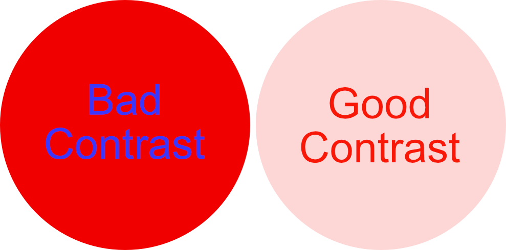
Welcome back to another post in my series “Principles of Design.” We’ve been exploring a few other topics: color and negative space, and today we’re going to be exploring contrast. This topic is so exciting to me because I love using contrast to make big impacts in my designs.
When we think about contrast, we typically think about two objects that are opposites of each other. And while, yes, that is an example of contrast, I would usually say that that is an extreme example. Usually, when we see contrast, the elements work together extremely well but are different enough from each other to provide some visual interest.
Using the example of black and white, I will usually use white paired with a medium/dark charcoal grey color instead of black to keep the item noticeable but less stark than a black. This is especially noticeable in text on a page. High contrast black text on a white page makes a stark impact. Reverse the colors to white text on a black background and the text may be more challenging to read.

The amount of contrast in a design may contribute to how heavy it feels. Do you want your visitors to feel like their socks were knocked off or gently welcome them to your page? Depending on the industry, you may want to consider how much contrast you have on your pages to give your visitors the right impression of your business.
Another area where contrast is beneficial is when you are selecting font pairings. If the client’s font already has a font, I will start there and then add a font to complement it. Typically if the primary font is a serif, you can pair it with a sans serif very nicely. The opposite is also true; sans-serif fonts are paired well with a serif font. This is generally because they are different (or have contrast) by nature. You can also pair two serif fonts or two sans-serif fonts, but they need to have enough contrast to work well together. Font pairings that are too similar can sometimes create an unpleasant design.
Contrast is also a crucial element of website accessibility. In fact, there are accessibility compliance standards for those with low vision that require text to be of a certain contrast for them to read the text without problems. Those with color blindness may also have trouble seeing text clearly without the proper amount of contrast.

I hope you learned something about contrast and how it relates to color in text, font pairings, general feel of the site, and accessibility. There are so many different applications across design and I’m constantly finding more.

